
Design sytem
What is design system?
A Design System is a collection of reusable design standards, rules, components, and guidelines that help teams create consistent user experiences across a product. Think of it as a single source of truth for design and development.
Instead of designing a new button, card, or input field every time, teams use predefined components from the design system.
Importance of Design system
The most important value of a design system is that it helps a product scale consistently and efficiently, faster designing & development and easier scaling in future.
Why I created this?
This design system is created for my project "Bookyter" but I think it suits similar E-commerce apps platfroms.
The goal behind creating this is to avoid and reduce Inconsistency, Repetitive Design, Faster Development, Product Scalability, Better Design and Developer Collaboration.
Who are benefited?
A design system when created properly adds advantage to the product it was created for and helping the product team to work efficiently with it. If we say who is directly benefitted so the answer will be "it doesn't directly effect and person but a group of person or team we can say". Because when a design system is there it helps to decide, design, code and test the product easily. It lays foundation to the design and development thus helping UX Designers, UI Designers, Developers, Product Managers, QA Team and ultimately the users of the mobile app.
Hierarchy in design system!
The hierarchy in design system refers to the different stages and levels of design system elements. Some elements are very smaller and hence cannot be broken. They can be used as it is without making any major changes in it where are some elements are mixed with some of these smallest elements to form them. For e.g. Typography and spacing is the smallest elements which cannot be broken further but when we make buttons, inputs by combining typography fonts, defined spacings we can customize them further by adding elements as per out requirement.

Atoms

Molecule

Organism

Templates
Contents of design system
Atoms:
Color palette
Typography
Grids
Spacing & Padding
Radius
Shadows
Molecules:
Iconography
Buttons
Inputs
Alerts
Banners
Labels
Organisms:
Navigations
Templates:
Headers
Product cards
Payment mode
Input Forms
Color palette

A structured color palette was created using primary, secondary, neutral, and semantic colors to support consistent UI states and interactions. Accessibility and readability were ensured by validating color contrast ratios using Figma accessibility plugins.
A structured color palette with clearly named variables was created to ensure consistency and streamline the design workflow. Color contrast was validated using Figma accessibility plugins to maintain readability and accessibility across the product.

Typograpgy
Montserrat was selected for its modern, clean appearance and strong readability on mobile devices. A scalable type system was established using a 1.16 Fibonacci-based progression from H1 downward, creating a consistent visual hierarchy while aligning with mobile UI typography standards.


A scalable type system was created using a 1.16 Fibonacci-based progression from H1 downward, following mobile UI standards. Reusable text styles were also defined to ensure consistency and speed up the design workflow.
Grids
A 4-column grid system was established for a 412px mobile viewport, using 16px gutters and 16px margins. This provided a consistent layout structure, ensuring proper alignment, spacing, and responsiveness across all screens.

Spacing & Padding

An 8px spacing system was established to create consistent layouts and component spacing. In cases where elements needed stronger visual association, 4px increments were used following the Gestalt Principle of Proximity. Padding and margins were standardized using 8px and 4px multiples to maintain a balanced and scalable interface.
Radius
To create a soft and friendly visual style, corner radius values were standardized across the system. Components with a height of 48px use a 24px radius, while 32px and 24px components use a 16px radius, ensuring consistent pill-shaped forms and visual harmony throughout the interface.

Shadows

A subtle shadow system was defined to create depth and establish visual hierarchy across components. Consistent elevation levels were used to distinguish interactive elements, overlays, and surfaces while maintaining a clean and unobtrusive appearance.
Iconography
To ensure clarity across different screen sizes, iconography was selected based on established design guidelines. Remix Icon was chosen for its extensive library, multiple icon variations, and seamless integration with Figma, enabling a faster and more consistent design workflow.

BuButtons & Selection Controlstton

Standardized button variants, including filled, outlined, text, and icon buttons, were created in both 48px and 32px sizes. Checkboxes, radio buttons, and toggles were also defined to ensure consistent interactions across the product.

Toasts

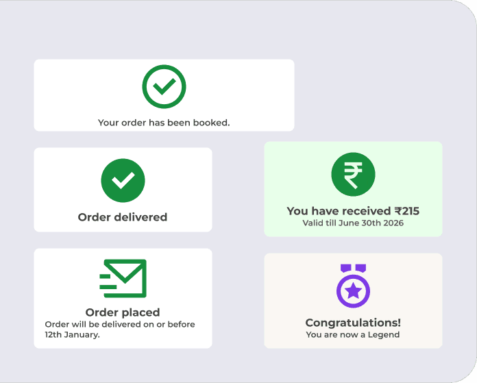
Alert banners were designed to communicate important information, warnings, errors, and success messages in a clear and consistent manner. Semantic colors and standardized layouts were used to ensure messages are easily recognizable and actionable.
Alerts
Alert banners and status cards were designed to provide clear feedback for events such as successful actions, order confirmations, errors, and user achievements. Consistent layouts, icons, and semantic colors help users quickly understand the message and take appropriate action.
Label
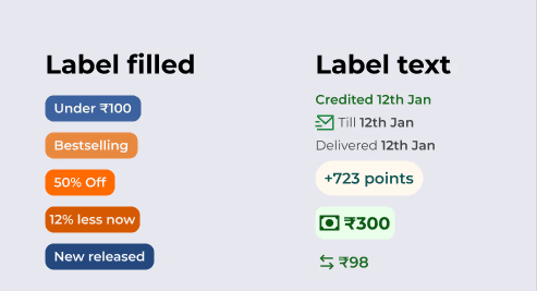
Filled and text labels were created to highlight discounts, offers, price drops, and book categories, helping users quickly identify key information.
Chips
Filled and outlined chips were created for filtering and sub-selections, enabling users to quickly refine and categorize content while maintaining a consistent interaction pattern.

Organisms: functional elements
Header
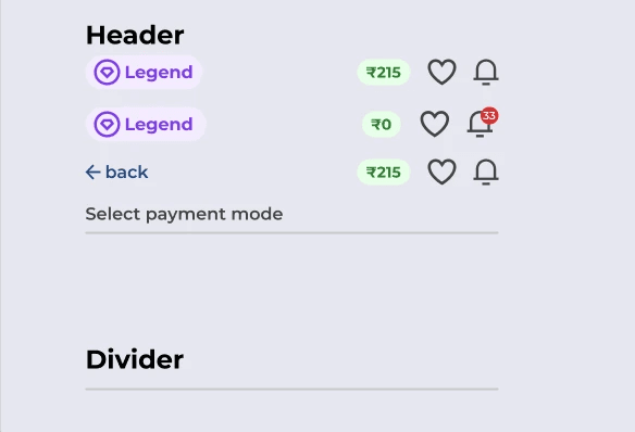
A flexible header system was created to support different contexts across the app, including the home screen, feature flows, and subsection pages. Variants included profile badges, wishlist, notifications, wallet balance, and contextual navigation elements to maintain consistency while adapting to user needs.
UI Cards
Reusable product card variants were created for book discovery across the home screen, search results, and other browsing experiences, ensuring consistent presentation of book covers, pricing, ratings, and key information.

Navigations
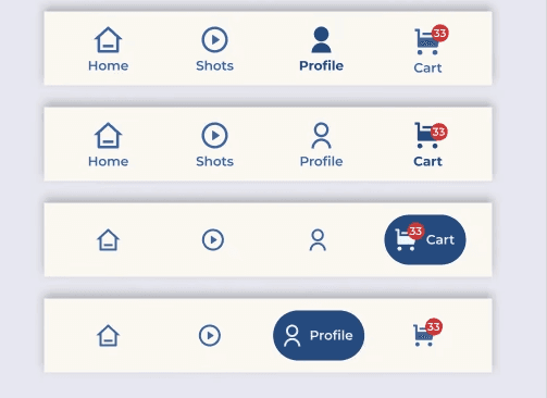
An expanding bottom navigation bar was created to provide quick access to key sections of the app. The active item expands to display its label alongside the icon, improving navigation clarity while keeping the interface clean and space-efficient.
Input Forms
Reusable input fields and form patterns were organized for easy drag-and-drop usage, enabling faster screen creation and consistent form experiences.

How to use?
To use these elements a designer only need to drag and drop or copy paste on the place where they want to use it.
If there will be small customization needed then they can simple modify padding, radius, colors, type, orientation of the elements.